911 connection
VisualC3 is a cutting-edge mobile and web app created to prioritize your safety. It links you directly to 911 services and even offers security monitoring when required. This user-friendly app ensures you receive help during emergencies and empowers you to report incidents, providing peace of mind.
Client:
Webhouse
Role:
Product Designer
Year:
2024
Overview and role
The company initially created a pilot product based on the developer's design for investors and clients.
As the sole designer on the project, my responsibilities were multifaceted. I led a redesign initiative, conducted competitor research to inform our design strategy, worked on the user flow, created wireframes and prototypes, and facilitated usability testing to refine the user experience. I also played a pivotal role in crafting the app's user interface, collaborating closely with cross-functional teams to ensure a cohesive and user-centric product.
Context
My product manager and I collaborated to assess our SOS feature using analytics to spot areas needing improvement and suggesting ways to make things smoother for users. When we noticed that the SOS button wasn't being used much, we decided to focus on the flow and conduct moderated usability testing with our users.
User portrait
We conducted usability testing with 10 users to gather insights. However, here's information about 5 of them. We tested our product with people from various backgrounds to identify any issues.

User’s challenges
During the testing, it became evident that most users expected immediate feedback or action after the loader animation, leading to confusion about the SOS activation status. There was also uncertainty about the next steps and what users should do, such as whether they could lock their phones and if they needed to wait for a call from 911.
Moreover, some users expressed concerns about the possibility of someone else pressing the "I'm safe" button on their behalf, impacting their sense of security. This fear of inadvertent button pressing added to the overall feeling of insecurity among the users. Overall, the testing shed light on various issues affecting the user experience during SOS activation.

The initial version of the active SOS button lacks progress visibility, and there's a risk of someone else pressing the 'I'm safe' button on behalf of the user.
Solutions
To address the challenges identified I proposed solutions including the integration of a progress bar with step-by-step explanations for connecting to 911, refining the application's copy to enhance clarity, adding a brief instruction guide for user actions such as locking the phone and finding a safe location during SOS activation, and introducing additional security measures such as setting a password or utilizing facial recognition to activate the "I'm safe" button. These enhancements aim to provide users with a more intuitive and secure experience, addressing concerns related to activation understanding, accidental button presses, and user actions during SOS situations.
First iteration
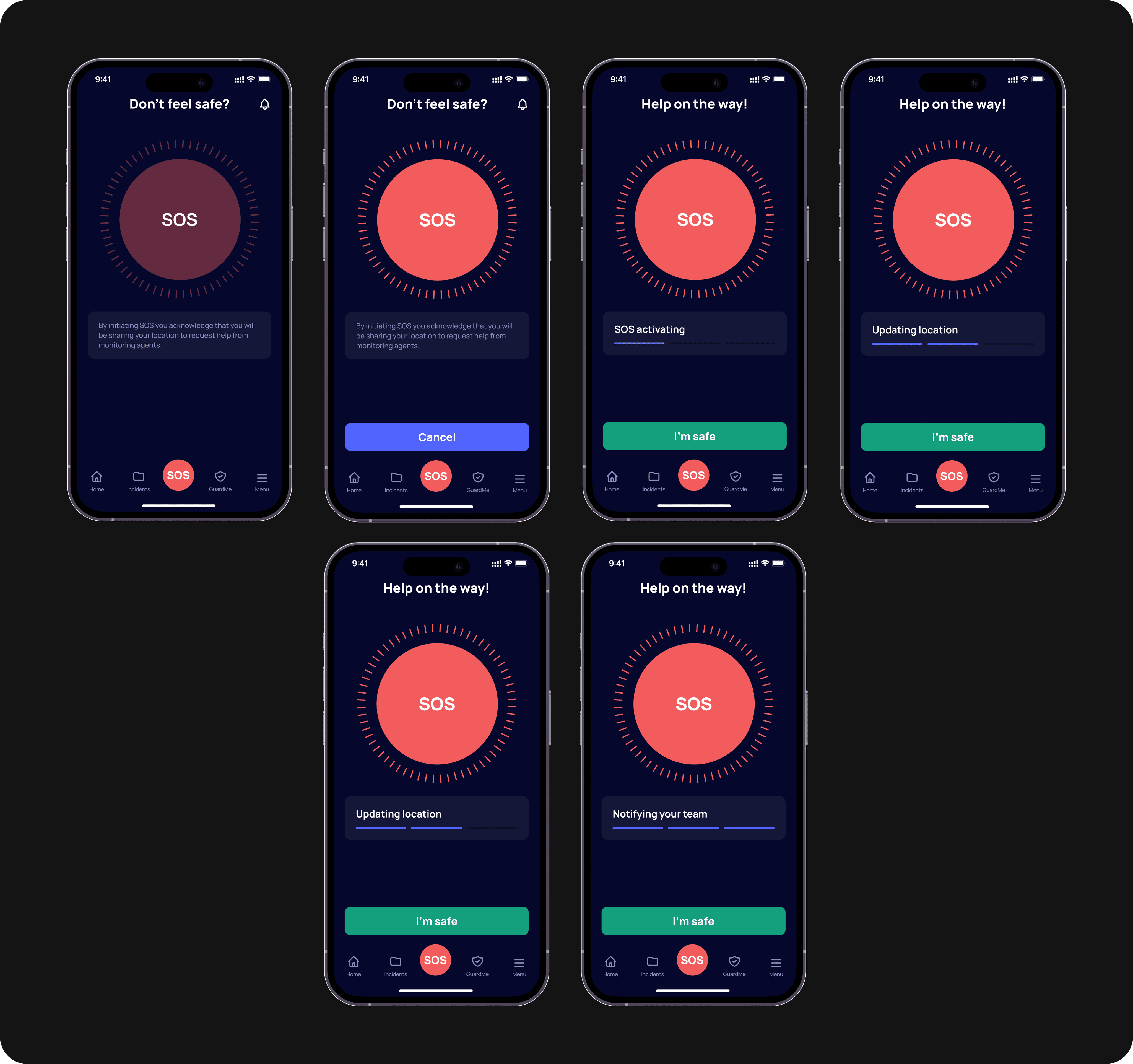
In the initial design iteration of the SOS flow, we introduced an inactive state for the SOS button, a cancel button for session interruption, and a three-step progress bar. However, usability testing uncovered several issues:
Users were confused by the inactive state of the SOS button, unsure if they could press it.
The “Cancel” button delayed SOS activation, so it was removed.
Despite the progress bar, users remained uncertain about the status of SOS activation.
These findings prompted us to simplify the activation process and provide clearer feedback on SOS activation status.

Final iteration
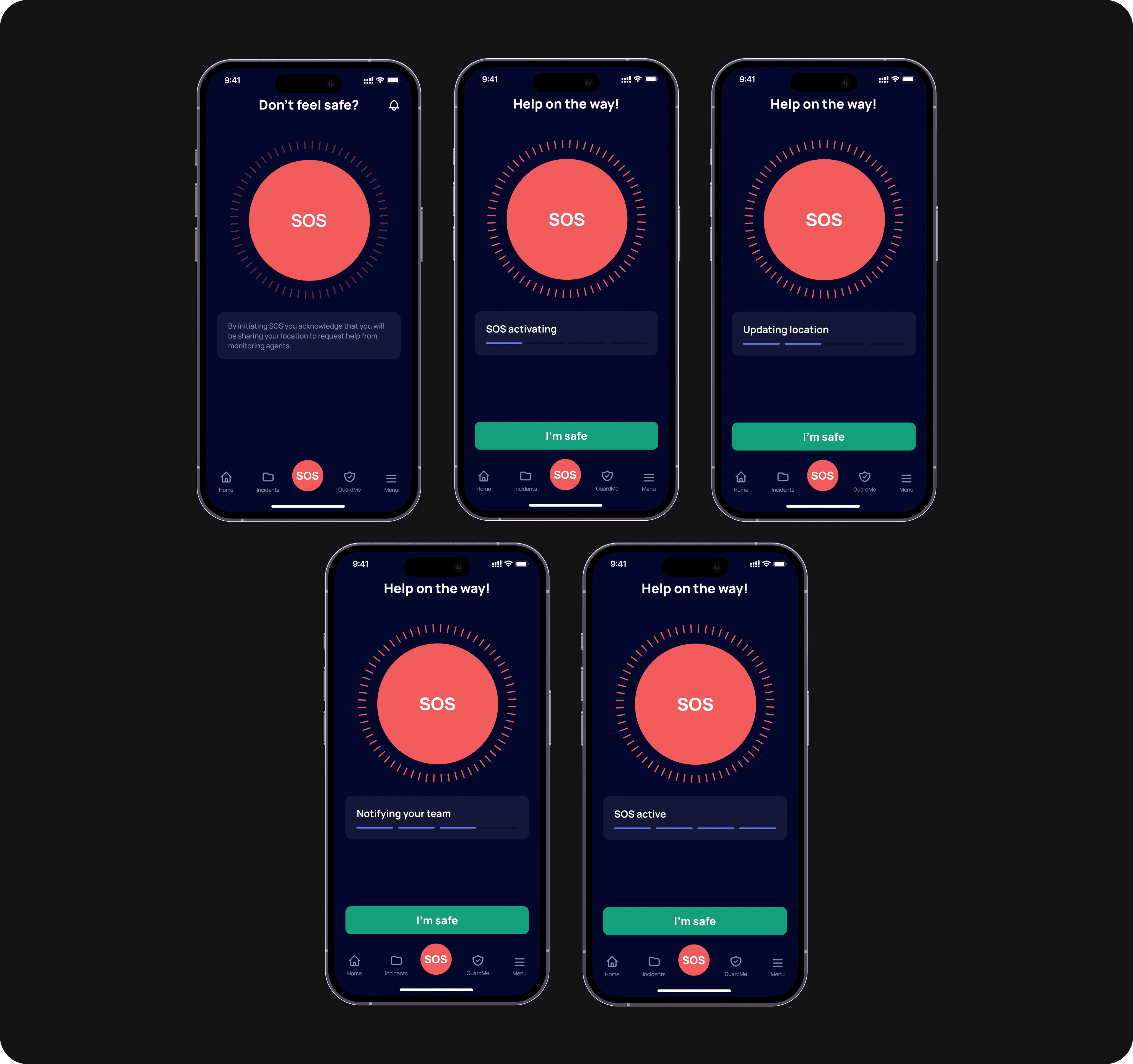
In the final iteration of the SOS flow, we made the following improvements:
We changed the color of the inactive state of the SOS button to improve clarity and user understanding.
The “Cancel” button was removed, and instead, users can now press the "I'm safe" button on each screen if they wish to cancel the session.
We added a fourth step to the progress bar to indicate when SOS activation is complete.
Following another round of usability testing, we confirmed that these changes addressed previous issues, resulting in a smoother and more intuitive SOS activation process.

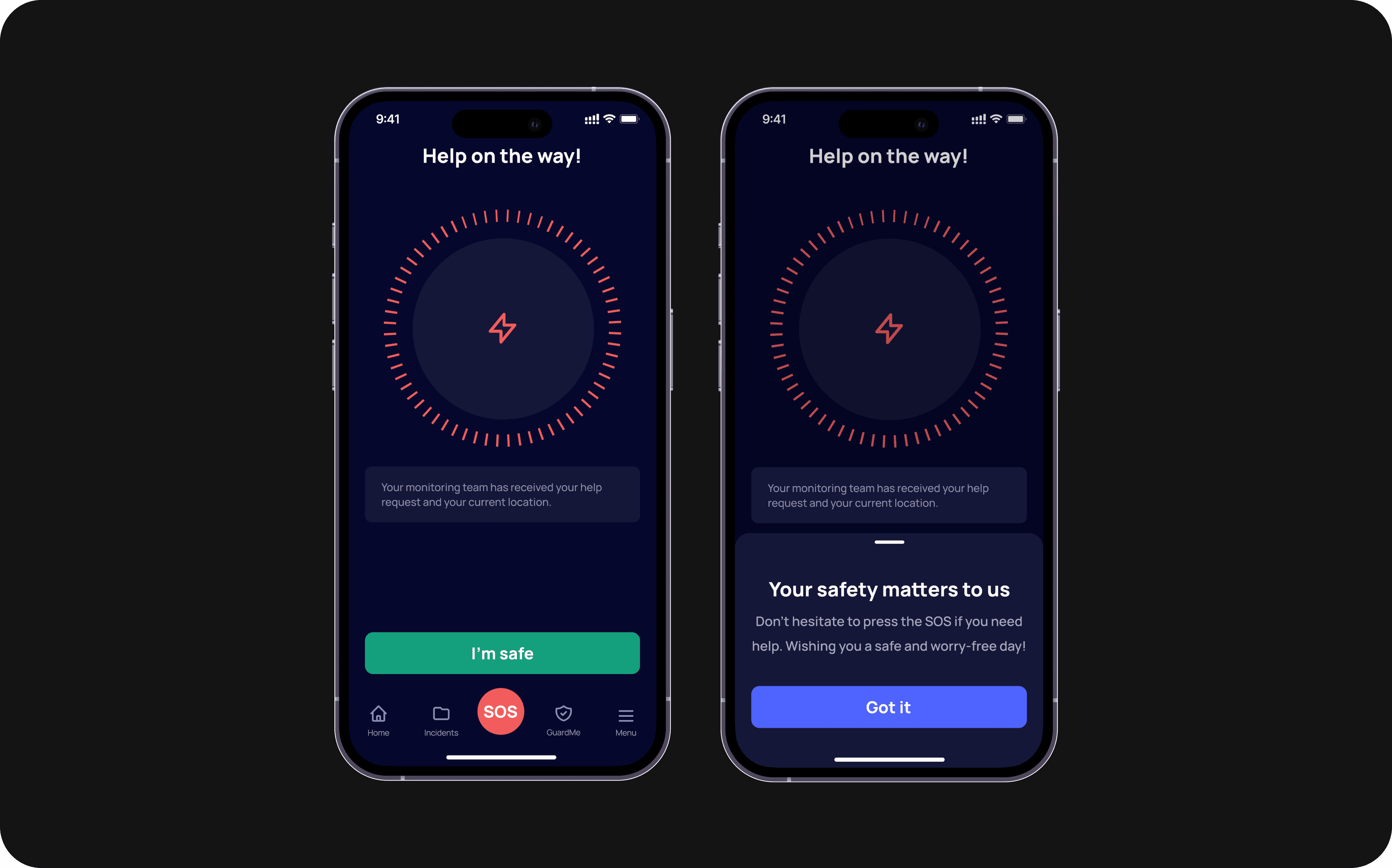
The SOS button is active and accompanied by a progress bar, providing users with real-time updates on the ongoing process. The steps of the progress bar change dynamically every few seconds, ensuring users are continuously informed about the current status.

After pressing the 'I'm safe' button, the user is prompted to authenticate using Face ID or a passcode. This additional step ensures supervisors are notified only when the user's safety has been confirmed.
Results
After concluding the final round of usability testing, we noticed a positive trend in the conversion rate of the SOS button, signaling improved user engagement and interaction with the feature. Moreover, users provided feedback indicating that the flow had become more intuitive.