VisualC3
VisualC3 is a cutting-edge mobile and web app created to prioritize your safety. It links you directly to 911 services and even offers security monitoring when required. This user-friendly app ensures you receive help during emergencies and empowers you to report incidents, providing peace of mind.
Client:
Webhouse
Role:
Product Designer
Year:
2023
Overview and role
The company initially created a pilot product based on the developer's design for investors and clients.
As the sole designer on the project, my responsibilities were multifaceted. I led a redesign initiative, conducted competitor research to inform our design strategy, worked on the user flow, created wireframes and prototypes, and facilitated usability testing to refine the user experience. I also played a pivotal role in crafting the app's user interface, collaborating closely with cross-functional teams to ensure a cohesive and user-centric product.
Business goals
The overarching goals for VisualC3 are to establish it as a leading safety and emergency response app in the United States and Canada, optimize operational efficiency by streamlining incident reporting, and foster trust through consistent delivery of a secure and user-centric service. Additionally, a key focus is on a comprehensive redesign of the app to enhance its features and competitive position in comparison to competitors like AppArmor and Rave.
Competitor analysis
We decided to start by analyzing competitors to achieve our goals. The analysis was initiated by selecting two prominent contenders in the U.S. market – Rave and AppArmor. VisualC3 users faced challenges with a less user-friendly interface, hindering smooth navigation. They anticipated a more intuitive design for seamless session navigation. Furthermore, users expressed confusion due to insufficient feedback, such as the lack of session progress updates and notifications.

Information architecture
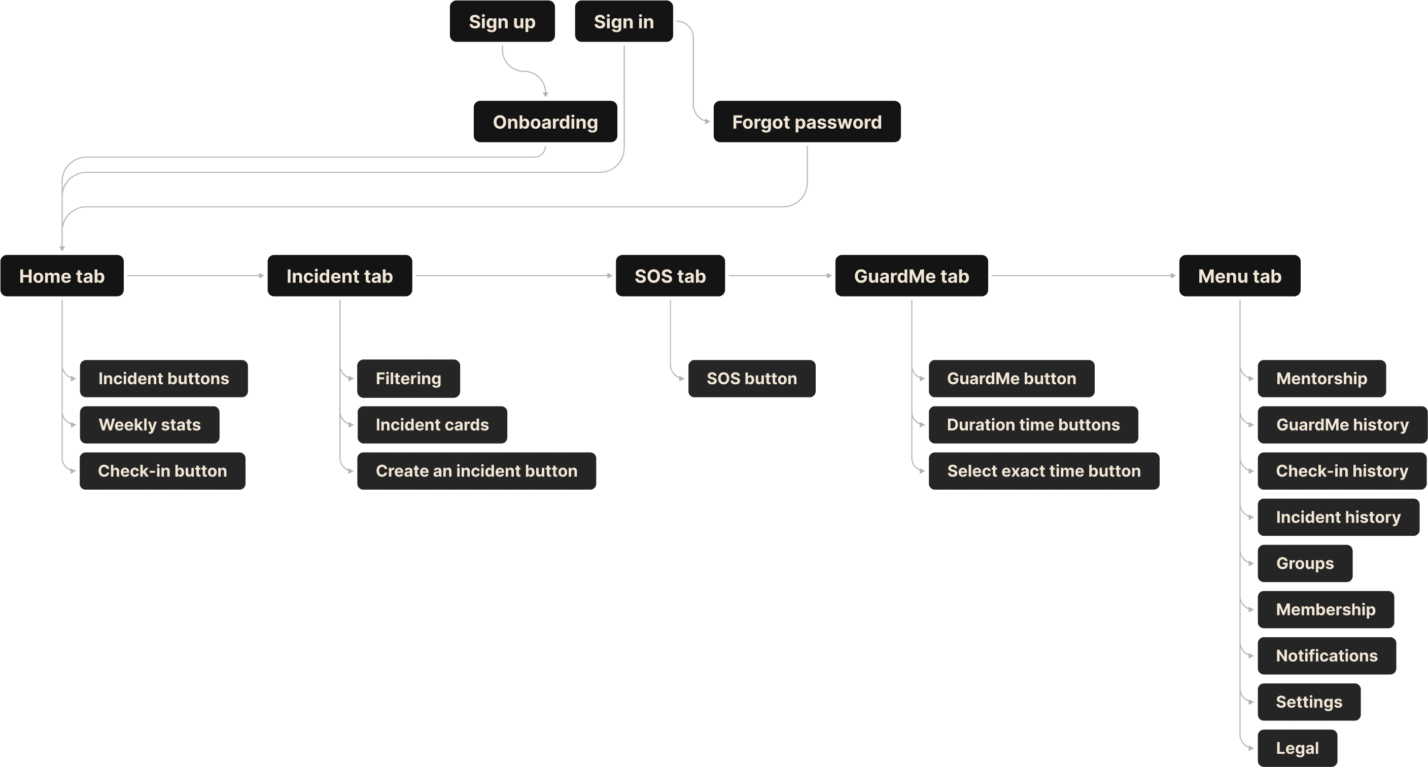
I structured the information architecture, organizing the content and interactions in a way that enhances overall user experience. This systematic approach helps pinpoint potential areas for improvement, ensuring a more intuitive and user-friendly application design. Additionally, feel free to explore the user flow by clicking the link.
Usability testing
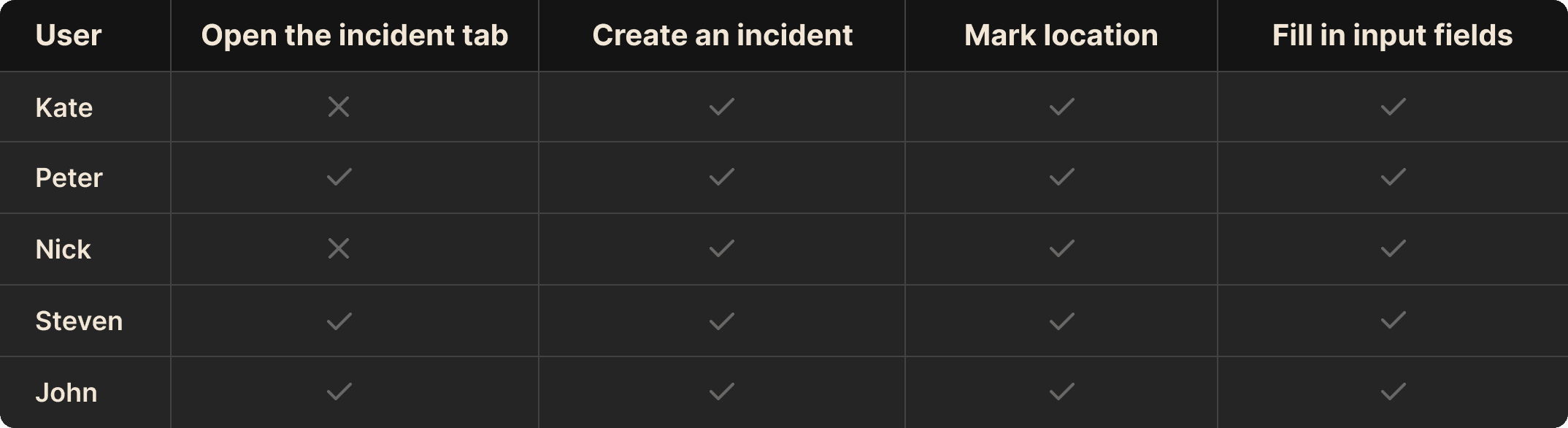
I conducted a series of four usability testing sessions for four main flows, with a specific focus on the Incident flow, involving five users across these sessions. The decision to conduct this extensive testing series stemmed from discussions with the development team. We wanted to see if making the process simpler, especially by removing some unnecessary steps, would cause confusion for users. This approach was all about understanding how users interact and finding places where we could make things better. The development team aimed to improve the process, but we weren't entirely sure if it would work, highlighting the importance of testing. I also tested the usability of other processes to make sure we have a complete understanding of how everything works.
The scenario
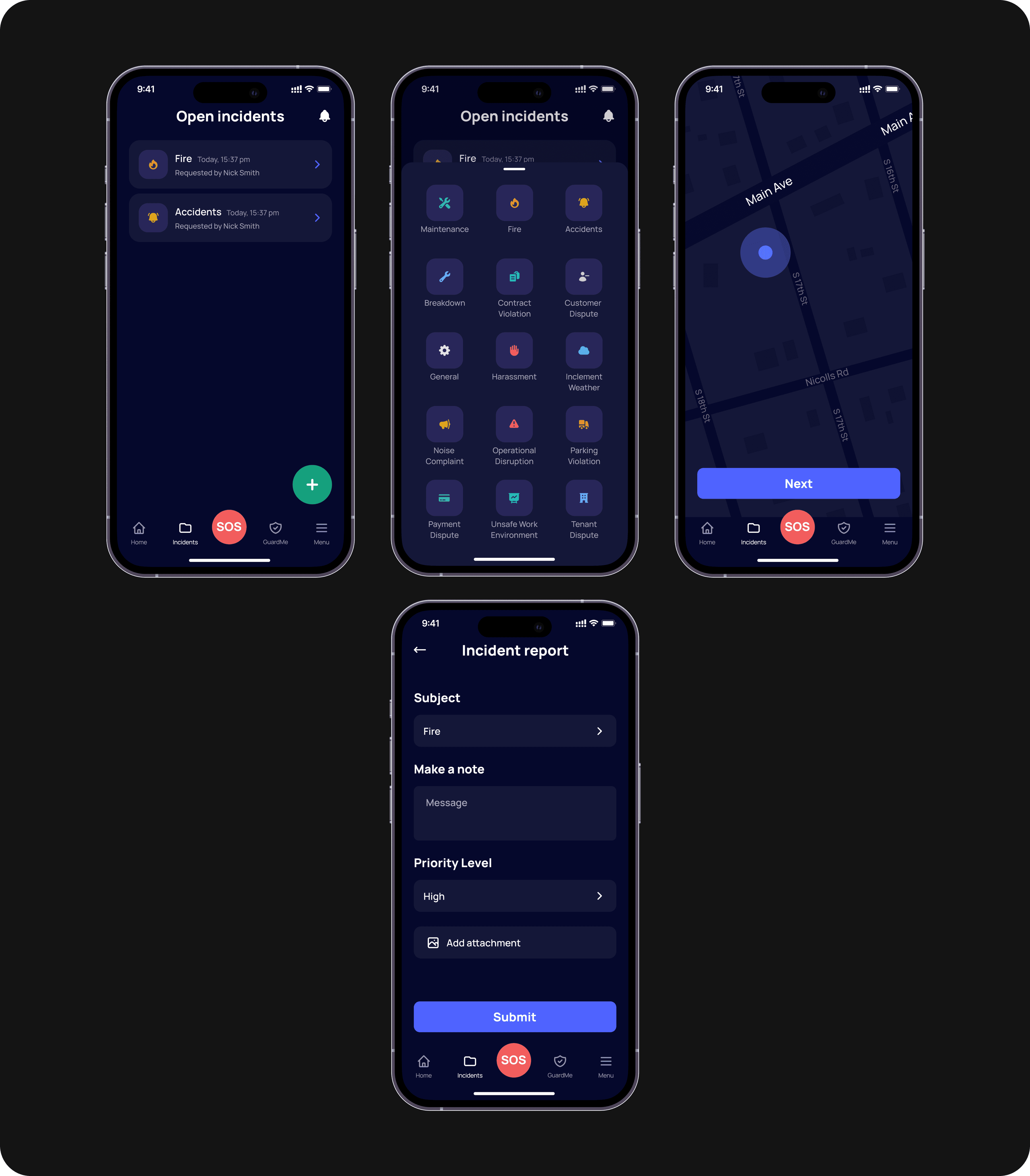
Our usability testing provided valuable insights into how real users experience the app. We identified a key problem during the "Create an Incident" part of the process.
We asked our users to imagine a scenario where they needed to alert emergency services about a fire at their location and consider how they would approach opening the incident report in such a critical situation.
Challenges faced by Kate and Nick:
Kate's Experience:
Kate encountered some difficulties during the second task. She didn't notice the "Create an incident" button and, decided to check the menu tab since she couldn't see any other options on the screen. Kate's experience reminds us of the importance of making the "Create an incident" button more noticeable to enhance the user experience.
Nick's Journey:
Nick faced similar challenges to Kate. He also couldn't find the "Create an incident" button and decided to click on an already open incident, hoping to locate it there. After a failed attempt, Nick went back to the first screen and, after some exploration, finally found the "Create an incident" button. Nick's experience underscores the need for clearer cues to guide users to the "Create an incident" button, making the app more user-friendly.
In summary, our usability testing revealed that improving the visibility and discoverability of the "Create an incident" button is crucial to ensuring a better experience for our users.
Second iteration
Following the results of usability testing, we have decided to make the "Create an incident" button bigger and change the color to green. The color has been chosen to improve contrast and draw users' attention more effectively, making it easier for them to identify and interact with the button.
To double-check the solution, we ran usability tests with five new users, and happily, everyone navigated through without any problems.
Results
In response to usability testing revealing challenges in locating the "Create an incident" button in the VisualC3 app, we enhanced its visibility by increasing its size and changing the color to green. This strategic adjustment, aimed at improving user experience, was validated through subsequent usability tests with five new users, all of whom navigated the Incident flow seamlessly. After the changes we made, the conversion rate of the button increased by 1,7%.
The conversion rate of the 'Start GuardMe' button increased by 4.2% reflecting positive changes made to address issues affecting conversion. We simplified the initial high visual load, streamlined the interface into a user-friendly step-by-step flow, personalized the second screen, and enhanced clarity based on user feedback, resulting in improved user satisfaction and an overall enhanced experience.
